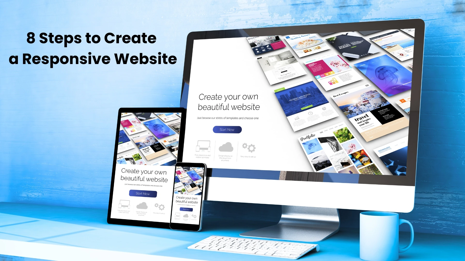
8 Steps to Build a Fully Responsive Website
Developing a website that is responsive & well-functional is crucial in today’s digitally progressive world. A responsive website ensures that your audience has the best experience possible on any device, whether you are the founder of the firm, the CEO building your brand, or a marketer establishing your online presence. Here’s a detailed guide to help you make one.
Step 1: Recognize Your Viewers & Their Technology
Start by figuring out who comes to your website and how they get there. Utilize resources such as Google Analytics to monitor their actions. For instance, it is imperative to ensure your website is optimized for smaller screens if a larger percentage of your visitors—suppose around 70% – make use of mobile devices.
Your design and development strategy will be shaped by this expertise, guaranteeing that your website appeals to & easily satisfies the specific requirements of your target audience.
Step 2: Apply a Mobile-First Design Approach
Begin with mobile design and expand to larger devices. Mobile-first ensures that critical pieces fit on smaller displays without compromising functionality.
For example, a restaurant website should make its menu, location, and booking button easily accessible from a smartphone. This technique is critical to creating a consistent experience across all devices.
Step 3: Select the Apt CMS or Framework
Pre-made responsive themes are included with frameworks like WordPress, Shopify, or Webflow, saving you the trouble of starting from scratch.
For instance, because of its versatility and extensive plugin library, our Web Development Company in Ahmedabad often suggests WordPress. Selecting the appropriate platform guarantees that your website is scalable, manageable, and prepared to expand along with your company.
Step 4: Prioritize flexible grids and layouts
Responsive websites use grids that change to fit the screen. Replace static pixel layouts with percentage-based grids. This makes your website’s content flexible, ensuring that features such as photos and text adjust to any device.
Take it like water-filling different-shaped glasses—it always fits perfectly. Bootstrap, for example, makes it easier to create responsive grid layouts.
Step 5: Optimize Images and Media
Large picture files slow down websites, particularly on mobile. To reduce loading time, use WebP formats and image compression technologies such as TinyPNG.
For example, a branding agency revamped an e-commerce site, lowering image sizes by 30%, and resulting in a 40% increase in mobile loading rates. Faster load speeds engage users and boost your SEO ranking.
Step 6: Implement Responsive Typography
Legibility is crucial. Use scalable fonts that adapt automatically according to screen size. A decent rule is to use 16px for body text on mobile and higher widths for headings. Avoid cramming too much text onto smaller screens; keep it simple.
This step improves the user experience, making it easier for visitors to access your website on any device.
Step 7: Test across devices and browsers
Once the design is complete, thoroughly test it. BrowserStack and Google’s Mobile-Friendly Test can help you test your site’s performance across numerous devices and browsers.
For example, at our website design company in ahmedabad, we ensure that every website is tested on iOS, Android, and a variety of browsers, including Chrome and Safari. This step prevents embarrassing glitches when your website goes online.
Step 8: Prioritize SEO and Speed
Performance is just as important to a responsive website as looks. Reduce the amount of CSS/JavaScript, use cache plugins, and compress media to speed up loading. Recall that quicker websites have higher Google rankings.
It’s also essential to use SEO tactics. By working with an SEO Agency, you can make sure that your responsive website will rank highly in search results and draw more visitors.
Why Responsive Design Matters
Were you aware?
- Mobile device traffic accounts for 52.2% of all website traffic.
- 53% fewer people visit websites that take longer than three seconds to load.
These figures demonstrate why responsiveness is crucial to the success of any firm and is not an option.
The Bottom Line
Creating a flexible website is now a strategic requirement rather than a technological luxury. No matter the device, you can develop a website that delights users and generates results by following these eight steps.
The Best Web Development Company in Ahmedabad, ETA Solution, focuses on SEO tactics and website building if you need professional advice. Allow us to assist you in creating a digital presence that elevates your brand to new heights and functions well on all screens.
