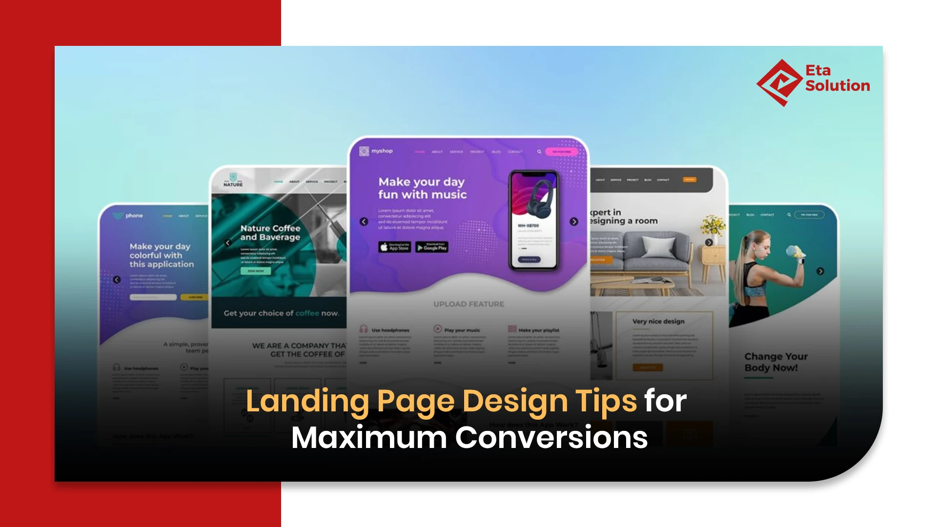
Proven Landing Page Design Strategies for Higher Conversions
Every click matters. Every scroll matters. Yet, on the other hand, a large number of companies spend a lot of money on getting more visitors but lose a lot of potential buyers. The reason is that their landing pages do not convert. In a world that is increasingly digital, a top-performing landing page is not simply an option; it is the heart of conversion rate optimization. Getting into the details of the scientific approach and the intangible aspect of the effective landing page design can have a very big impact on the way you engage your visitors and, eventually, on your income.
What Are the Characteristics of a Landing Page and Why Conversions Are Important
Unlike a homepage, which serves multiple purposes, a landing page’s success is measured purely by its conversion rate, the percentage of visitors who complete the desired action. A standalone web page called a landing page was made with the sole purpose of encouraging the visitors to carry out one particular action, e.g., to subscribe to a newsletter, to get a resource, or to finish a purchase.
Stating the matter very concretely: According to HubSpot, businesses having between 10 and 15 landing pages experience a rise in leads of up to 55%. At the same time, badly organized pages can make more than 70% of the visitors leave in a matter of seconds.
Therefore, every landing page element from the headline to the call to action is fundamental in the landing page optimization guide and conversion rate optimization.
The Role of a Clear and Attractive Headline
A headline is the first impression, and first impressions always count. An effective headline:
- Succinctly delivers the value proposition.
- Showcases the link or the gist of the headline within 3 seconds.
- Acts as a doorway into the rest of the text.
Have a look at the early Dropbox landing page: “Keep your files safe, synced, and easy to share.” A straightforward, positive, and brief statement that shows the users the benefits they get. When it comes to landing page design tips, you should always keep in mind that clear is king.
Writing Engaging and Benefit-Focused Content
One way for the headline to lead a visitor to the supporting copy, which, in its turn, has to strengthen the headline. Good landing page content is:
- Not only feature-focused but also feature-benefits. Your clientele wants to know how your product is going to help them get rid of their problems.
- It should also be easily readable and concise. In addition to short paragraphs, presenting the main points in bullet points and using some suitable subheadings can make the text more interesting for the readers.
- It should also be very convincing and honest. One who rants about their product excessively may lose the trust of their audience.
An often-overlooked detail is the use of “you-centric” language. Copy framed around the visitor’s needs, “Save time with automated workflows” instead of “Our platform automates tasks” increases engagement by up to 25%, according to marketing studies. This is a key principle in landing page UX design.
Using Strong Calls-to-Action (CTAs) for Higher Engagement
A landing page that converts wonders is basically dependent upon what is known as an actionable CTA. The key principles are:
- Visibility: Your CTA button should not only be different in color but also in location so that it instantly catches the reader’s eye.
- Clarity: The words should explain the action to be taken. For instance, “Get Your Free Guide” is more effective than “Submit.”
- Urgency: Terms like “now” or “today” bring out subconscious psychological pokes.
The best brands that achieve high results usually have micro-CTAs within their sections. To illustrate, Spotify, during the middle of the scrolling user activity, prompts: “Listen Free Today.” This multi-point method boosts the rate of conversion as it accomplishes the goal of capturing the attention of potential customers at different levels of engagement.
Role of Visual Hierarchy and Layout in Landing Page Design
Design is not only about beauty; it also communicates the main idea to the customer. Landing page layout ideas should follow a visual hierarchy that is easily understood by the customers:
- Primary CTA above the fold: Although the action space is limited, the immediate visibility called for a performance without the need to scroll down.
- Balanced white space: A main function is that it highlights the less visible or quieter elements, and at the same time, it does not allow cognitive overload.
- Directional cues: Arrows or images are pointing at the CTA, so they can introduce you to the next step without you realizing it.
According to NNGroup, users look at the content of a web page in an “F-shape” pattern. Therefore, organizing your landing page best practices according to this natural flow of reading may increase your conversions by 20-30%. The expertise of a website design company can easily bring these subtle hints into your page layout if you are a business eyeing the industry.
Importance of Mobile-Friendly and Responsive Landing Pages
Before all that comes over 60% of web traffic that comes from mobile devices, making mobile optimization practically non-negotiable. Some of their main worries are:
- Responsive design: No matter what the size of the screen, the layout just changes smoothly to fit it.
- Touch-friendly CTAs: One should be able to press the button without any hassle.
- Short loading times: Mobile users are not patient, and so they expect the pages to pop up within three seconds of request.
Google’s mobile-first indexing means that if your page is not optimized for mobile, it may not be ranked highly or it may not even show up in search results. The creative User Experience design for the landing page guarantees that each visitor’s browsing will be smooth without any barriers.
Using Trust Signals to the Fullest Extent: Testimonials, Reviews, and Badges
Determining whether the site is trustworthy, visitors will, in a very short time, ask themselves whether what they see is true or not. One of those trust-increasing elements is social proof that generally leads to more conversions :
- Customer testimonials: Nothing is more powerful than true experiences to be heard better than usual claims.
- Third-party reviews with ratings: Trustworthy platforms such as Trustpilot are a source of dependability.
- Security badges or certifications: The showing of SSL, payment safety, or industry awards, etc., is what assures the shyest buyers.
Thousands of people lining up and shouting their approval might be thought of as an essential need for trust in your business, but if there was only one thing trusted in the world, it would be written words in the form of testimonials and reviews. A survey by BrightLocal shows that 88% of consumers place as much value on online reviews as on personal recommendations. All these trust signals could be a landing page’s breath of fresh air.
Optimizing Page Load Speed for Better User Experience
Slow-loading pages are a major headache for users and cause a significant loss of traffic. The Google report informs that the page loading delay of just one second can cause a seven percent drop in conversions. Some of the best practice points for speeding up page loading are:
- Firstly, images can be reduced in size without quality loss.
- Secondly, unnecessary scripts can be minimized or even totally removed.
- Thirdly, browser caching can be used.
The achievements of businesses looking for a Website design company in Ahmedabad are often the outcome of the decision by the professionals to adopt the latest optimization techniques, such as the implementation of server-side rendering and lazy loading. Improvements like these in the landing page optimization guide ensure the fast and optimal working of the website.
A/B Testing Landing Page Elements for Continuous Improvement
It is not a simple job to build a valuable landing page, and at the beginning, its perfection cannot be assumed. Hence, A/B testing provides a company with more alternatives for the next stage of their business:
- Comparing two different headlines, CTAs, or layouts.
- Determining the version that impacts the audience more positively.
- Testing and updating pages based on actual user behaviors.
The likes of Airbnb experiment with no fewer than hundreds of A/B tests annually. In doing so, they are continually refining their approaches, testing everything from the color of the button to the headline rewritten. This type of landing page strategy is the key to improving pages with respect to the users’ behavior.
Best Practices for Designing Landing Pages That Convert
There is a close correlation between the good practices of landing page best practices and the insight from the industry experts’ top-performing campaigns. Some of the successful steps include:
- One sole focus or goal: By doing so, you will be able to avoid the existence of a myriad of other offers on your landing page, which will confuse your visitors.
- Taking on board the four realms, branding, setting, and music, of your company’s overall identity by simply keeping the colors, fonts, and tone in line with your branding.
- Triggering emotions: Storytelling or scarcity could be used to bring about an emotional response that will encourage the desired action.
- Allowing users to have what they want in the easiest manner: Visual distractions could be reduced on your landing page to make it easier for users to use the page, for example, by removing unnecessary menus.
The landing page for Basecamp’s project management tool is a significant example from the real world. The page is created with a minimalist approach, contains clear value propositions, has strong call-to-actions (CTAs), and shows user testimonials. These are all designed and arranged to allow for high converting landing pages. Any company that is seeking to increase landing page conversions can adopt such measures.
Besides that, the landing page best practices may result in a complete change of an important part of your website, thus leading to a higher conversion rate. A headline to the CTA can become a conversion machine by using these best practices that are turned on by the services of a web design company in Ahmedabad.
Final Take
Landing pages are the ones that bring in money. Every single detail, from an appealing headline to a quick-loading mobile design, is a contributing factor to the overall performance. In today’s competitive digital world, one cannot just rely on the old way of thinking, i.e., guessing. The brands that are winners are those that treat landing pages as a dynamic, data-driven resource.
Just imagine: is your landing page only a simple page for the visitor to get information, or is it a powerful conversion machine? Every visitor is a potential customer for you. So, the way you do your conversions might be the difference between just getting a click and a lost opportunity.
If a business wants to be ahead of the game, then it would be highly recommended for them to hire a website design professional in Ahmedabad. This will not only make your landing pages visually attractive but will also allow you to strategically plan design for conversions.
Designing a landing page in WordPress is easy using drag-and-drop builders like Elementor, Divi, or Beaver Builder. Start by choosing a clean template, add a strong headline, short and clear content, an attractive image, and a Call-to-Action (CTA) like “Buy Now” or “Sign Up.” Keep the layout simple, remove unnecessary menu links, and focus only on the main goal — getting visitors to take action.
To design a landing page in Photoshop, create a new document with your preferred web dimensions (like 1920×1080 px). Then, design each section — header, hero banner, features, testimonials, and CTA — using shapes, text, and images. Use a consistent color theme and readable fonts. After finalizing your layout, you can export the design and give it to a web developer to convert it into an actual webpage.
In Wix, you can design a landing page using its Wix Editor or ADI builder. Choose a blank or landing page template, then customize it with your content — headline, image, product info, and CTA button. Wix also allows you to hide navigation menus and add forms easily. Make sure your design looks great on both desktop and mobile for better conversions.
A well-designed landing page helps promote your business by focusing on one clear message or offer. It captures your audience’s attention, builds trust, and encourages them to take action — like booking a service, downloading an ebook, or making a purchase. It’s a powerful tool for turning visitors into leads or customers through clear design, persuasive content, and a strong CTA.
Every click matters. Every scroll matters. Yet, on the other hand, a large number of companies spend a lot of money on getting more visitors but lose a lot of potential buyers. The reason is that their landing pages do not convert. In a world that is increasingly digital, a top-performing

What started as a passion for marketing years ago turned into a purposeful journey of helping businesses communicate in a way that truly connects. I’m Heta Dave, the Founder & CEO of Eta Marketing Solution! With a sharp focus on strategy and human-first marketing, I closely work with brands to help them stand out of the crowd and create something that lasts, not just in visibility, but in impact!

Facebook Ads for Local Businesses: A Complete Guide
How to Fix Plugin Conflicts in WordPress